Enhanced user journeys in a competitive market
A utility provider identified a significant challenge in their digital experience: customers were contacting the call centre in high volumes to complete tasks related to signing up for new services and switching existing services. Although both tasks were technically available online through the “Account” section of the website, users were struggling to understand where to begin, what steps were required, and how to successfully complete their journey without additional support.
This project focused on understanding how content design and UX writing influence user behaviour at every stage of a digital journey. Through user research, journey analysis, and content evaluation, it became clear that the challenge was not simply a navigation issue—it was also a communication problem. Labels, instructions, page structure, and microcopy were not providing enough context or confidence for users to move forward. Small content decisions, such as menu labels, button text, error messages, and guidance throughout the process, played a critical role in helping users understand their options and take the next step.
Research findings informed recommendations for a redesigned user flow that better reflected customer goals and mental models. The new experience used clearer information architecture, more intuitive navigation, and purposeful UX writing to guide users from their initial task through completion. By treating content as a core part of the interaction design—not an afterthought—the redesigned journey reduced confusion, supported self-service, and helped customers complete important account tasks with greater confidence.
Understanding user flows
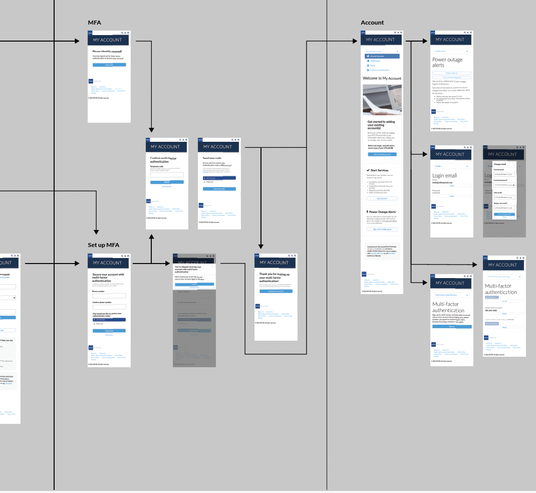
Signing up for and switching utility service is a multi-step process. In order to understand where users were getting lost we had to understand their journey.
Breaking down the journey into individual screens they encountered helped us see where things were going wrong.
Important findings
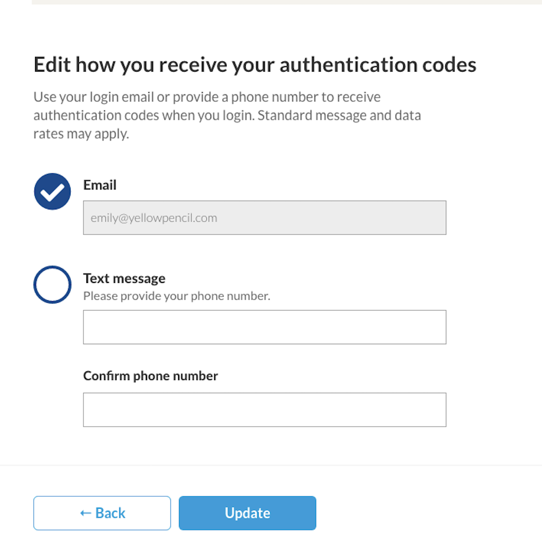
In addition to the overall structure of the site, once users were trying to complete tasks they were getting lost. Some got lost simply trying to choose which service they were switching from. It was clear that the visual cues on the webforms were lacking as well as sufficient instruction.
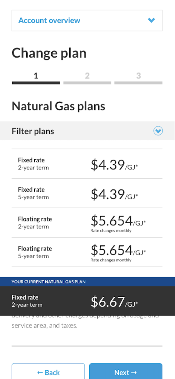
When it came to choosing a new plan and signing up for notifications users were confused by inconsistent terminology and the inability to compare plans.
Updated user flow
Additional screens were created, and new functionality suggested to help guide users through this journey.
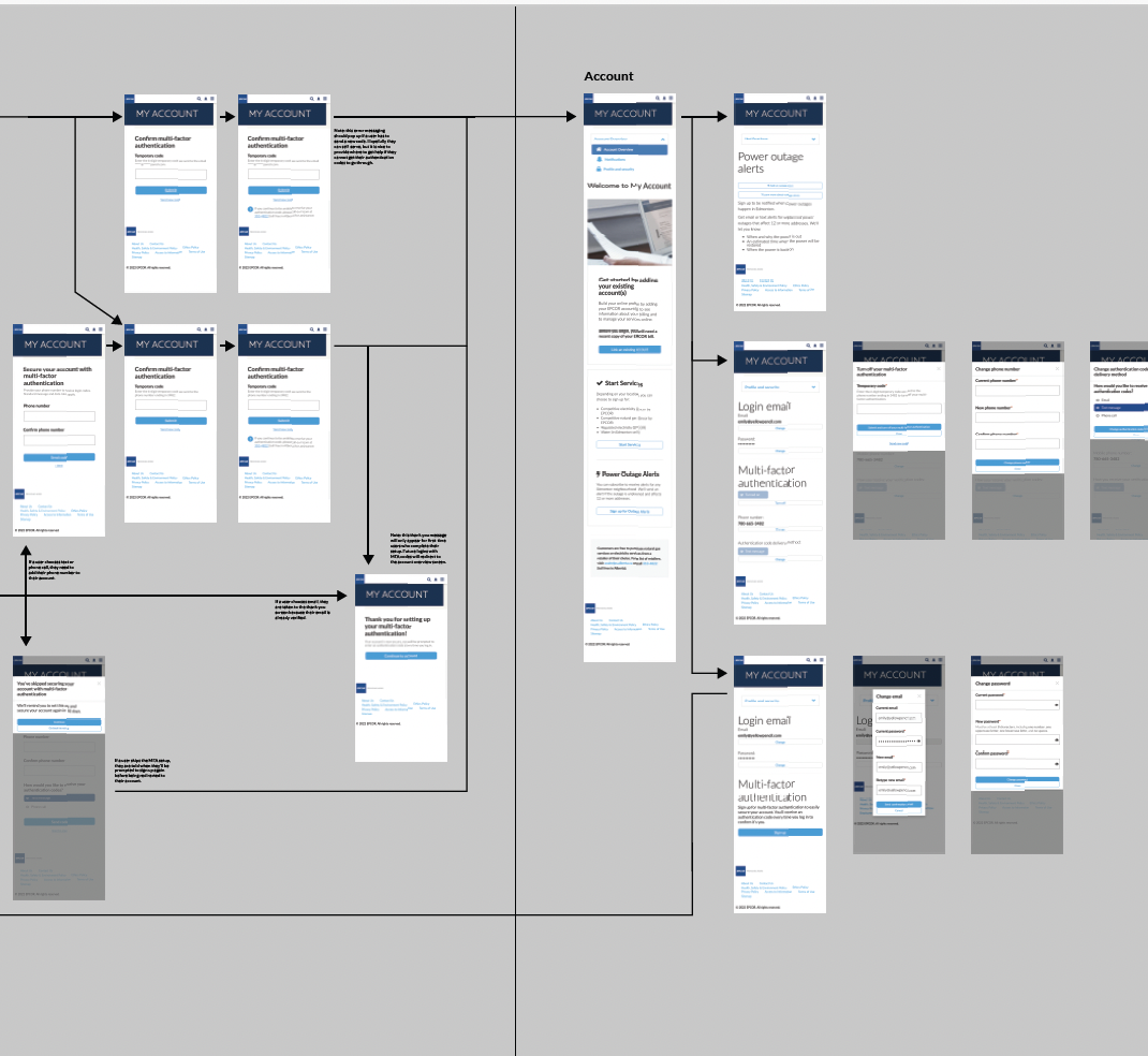
Even though the original user journey seemed complex, it was missing a lot of steps and as a result the site was missing important information.
It is crucial to talk to users when determining where they are getting lost. Too often, subject matter experts are responsible for content and design decisions. Their expertise can blind them to holes in their workflows.