Structured programs for Continuing Education
As part of a comprehensive website redesign, Capilano University's Continuing Education program content was restructured to create a more consistent, intuitive, and user-centred experience. The project focused on applying content design principles to improve how prospective students discovered, understood, and compared programs, while establishing a scalable content model that could support future growth.
An audit of the existing content revealed significant inconsistencies in page structure, terminology, and information hierarchy. Similar programs presented information in different ways, making it difficult for users to compare options or locate key details such as admission requirements, delivery formats, schedules, and career outcomes. This inconsistency also created challenges for content governance, making it harder for teams to maintain quality across the site.
Content design was used to establish a standardized structure based on user needs rather than internal organizational preferences. Working closely with stakeholders, reusable content patterns were developed that defined what information belonged on every program page, how it should be organized, and how users would move through the content. Information architecture decisions ensured that related content was grouped logically, while UX writing improved clarity through consistent headings, descriptive labels, plain language, and action-oriented calls to action that guided users through their decision-making process.
Standardizing the content structure did more than improve visual consistency—it created a predictable experience that reduced cognitive load and helped users build confidence as they explored different programs. When every page follows familiar patterns, users spend less time figuring out how to navigate the content and more time evaluating the information that matters to them.
The resulting content model established a foundation for scalable governance, making it easier for content authors to create and maintain high-quality program pages while ensuring a consistent experience across the Continuing Education website. The project demonstrated how thoughtful information architecture, content design, and UX writing work together to transform content from a collection of individual pages into a cohesive, user-focused digital experience.
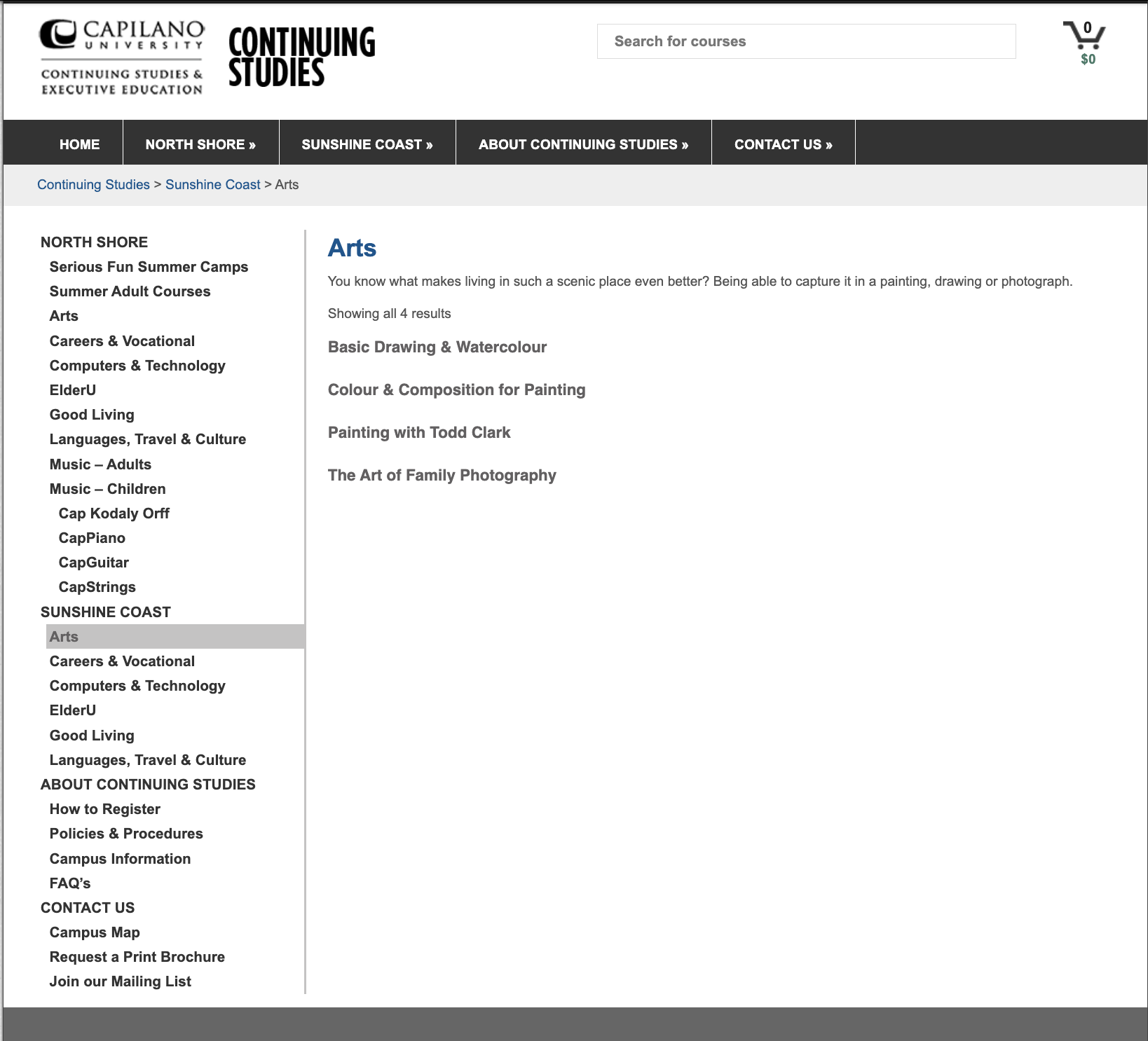
Program landing page before (left) and after restructure. The original landing page reflected an organization-centred approach to content, with inconsistent information hierarchy, generic headings, and little guidance to help users understand where to begin. Key information was difficult to scan, related programs were not surfaced effectively, and the page provided few opportunities for prospective students to continue exploring. As a result, users were required to do more work to identify relevant offerings and determine their next steps.
The redesigned landing page applies content design and UX writing principles to create a clearer, more engaging experience. Content is organized around user priorities, with a logical information hierarchy, descriptive headings, and scannable sections that support exploration. Program categories are easier to compare, calls to action are more purposeful, and navigation patterns encourage users to move naturally between related offerings. Rather than functioning as a simple index of programs, the landing page now acts as an entry point that helps prospective students quickly understand their options, build confidence in their choices, and continue their journey with clear next steps.
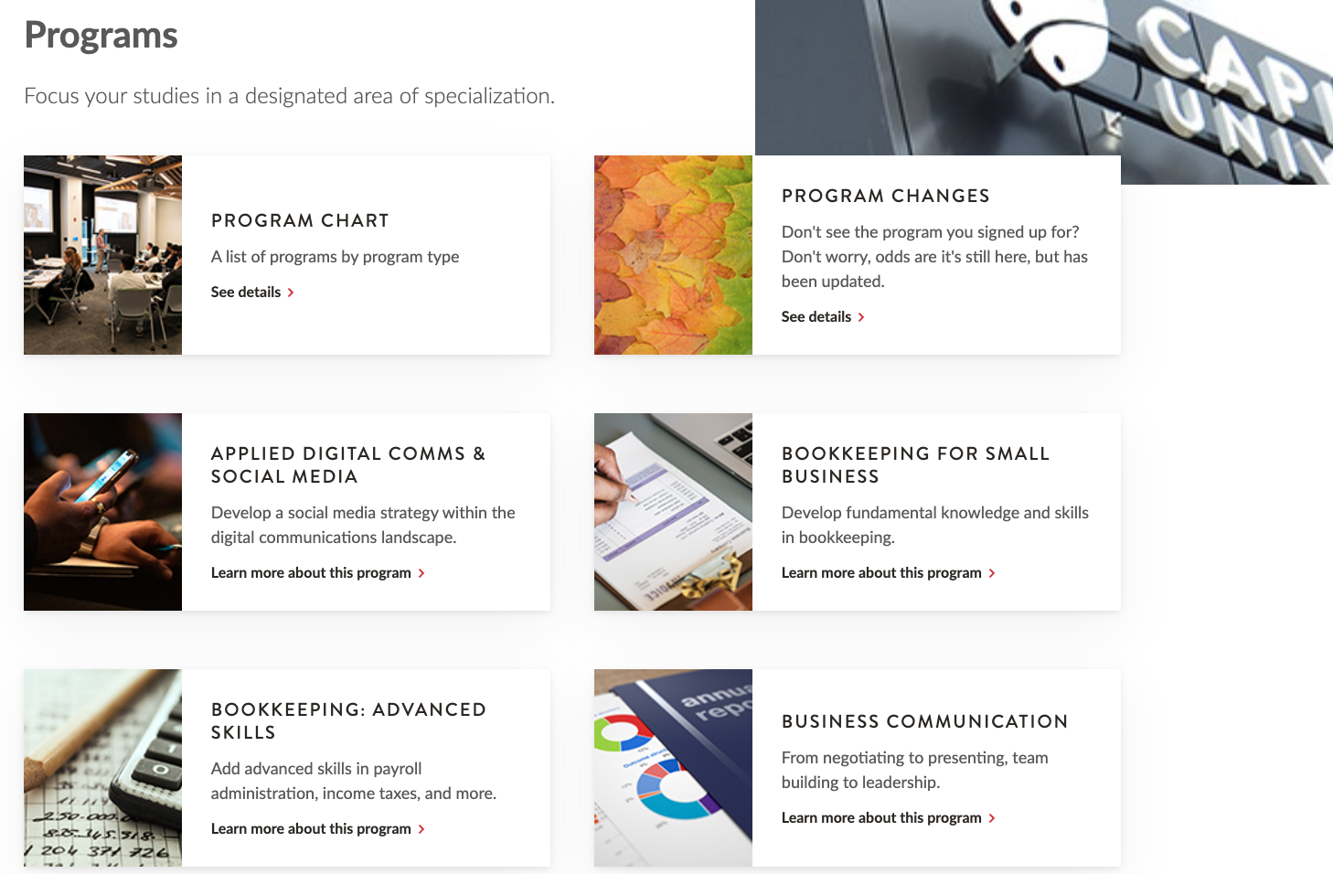
Before the redesign, program content was created and maintained using a rich text editor, allowing each page to be structured independently. Without a defined content model or standardized page template, information appeared in different orders across programs, headings varied significantly, and key details were often buried within long blocks of text or omitted entirely. This inconsistency made it difficult for users to predict where information would be located and increased the effort required to evaluate different program options.
From a content design perspective, the lack of structure created unnecessary cognitive load. Users struggled to compare programs because important information was presented differently on every page. UX writing was also inconsistent, with varying terminology, unclear headings, and calls to action that did little to guide prospective students through their decision-making process.
These issues extended beyond the website itself. Because users were unable to find or confidently interpret the information they needed, call centres received a high volume of inquiries about program details that should have been easily accessible online. Establishing a structured content model and consistent information architecture addressed these challenges by creating predictable page layouts, improving scanability, and supporting clearer, more user-focused content across the Continuing Education website.
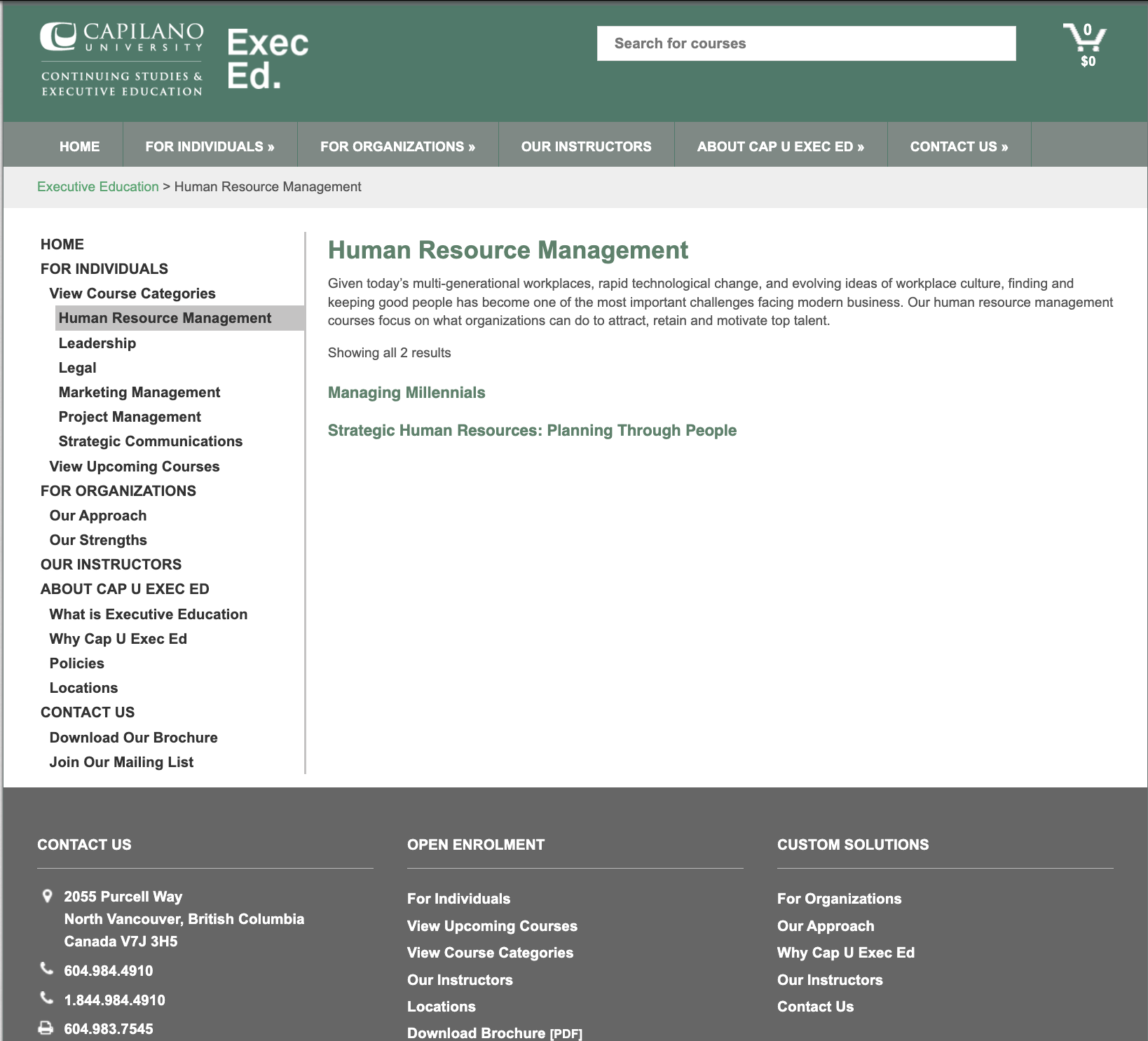
Content structure can feel rigid, but it is good for users. Knowing how to use structure in creative ways, through well written content, sets great websites apart from good ones.
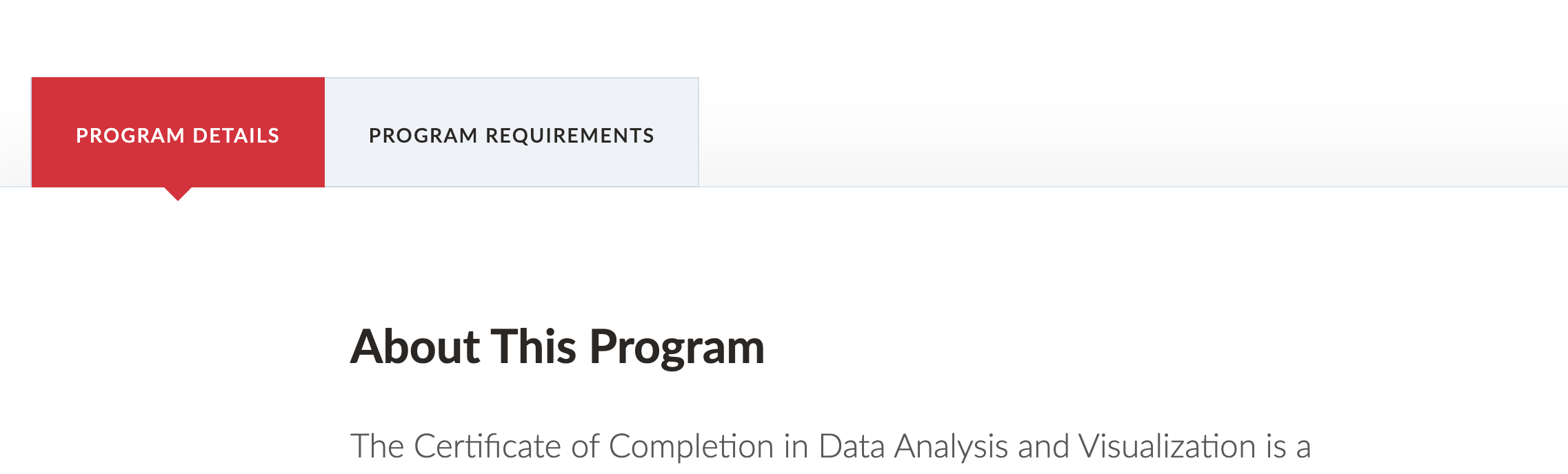
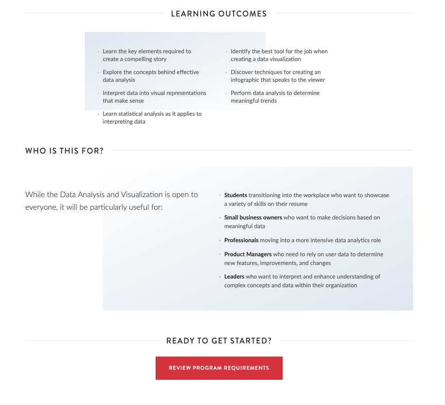
New program pages feature structured tabs to help users know the type of information they are looking for.
Within the tabs, required fields for learning outcomes and other information helps users not only understand the program they are looking at, but also creates an easier comparison between programs.
Users do not have to scroll back up to the tab navigation to continue reading, a button has been provided to take them to the next step.